Signup Journey
Making it more faster & intuitive for new users.
00

Problem
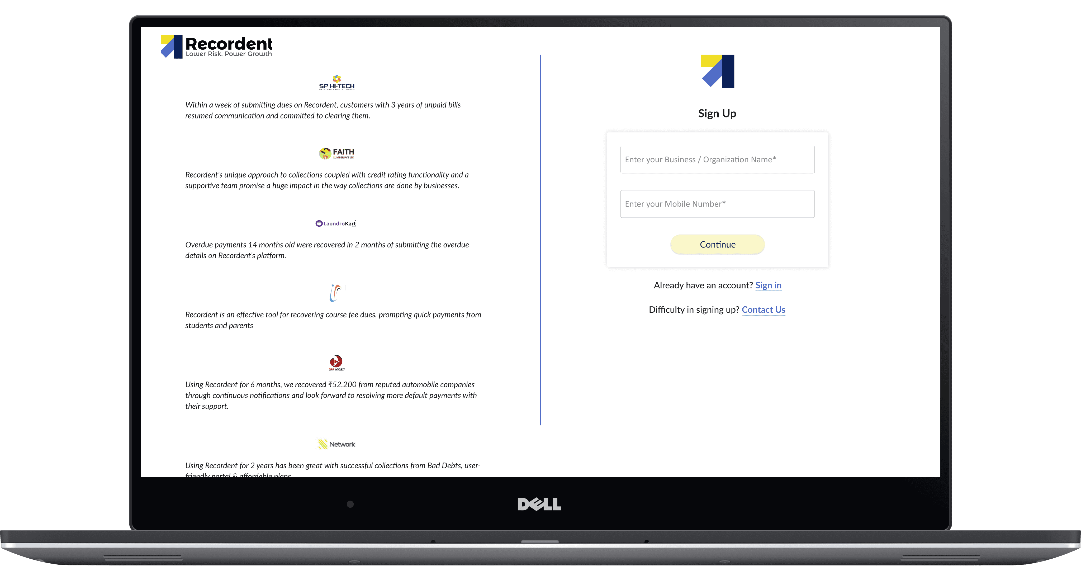
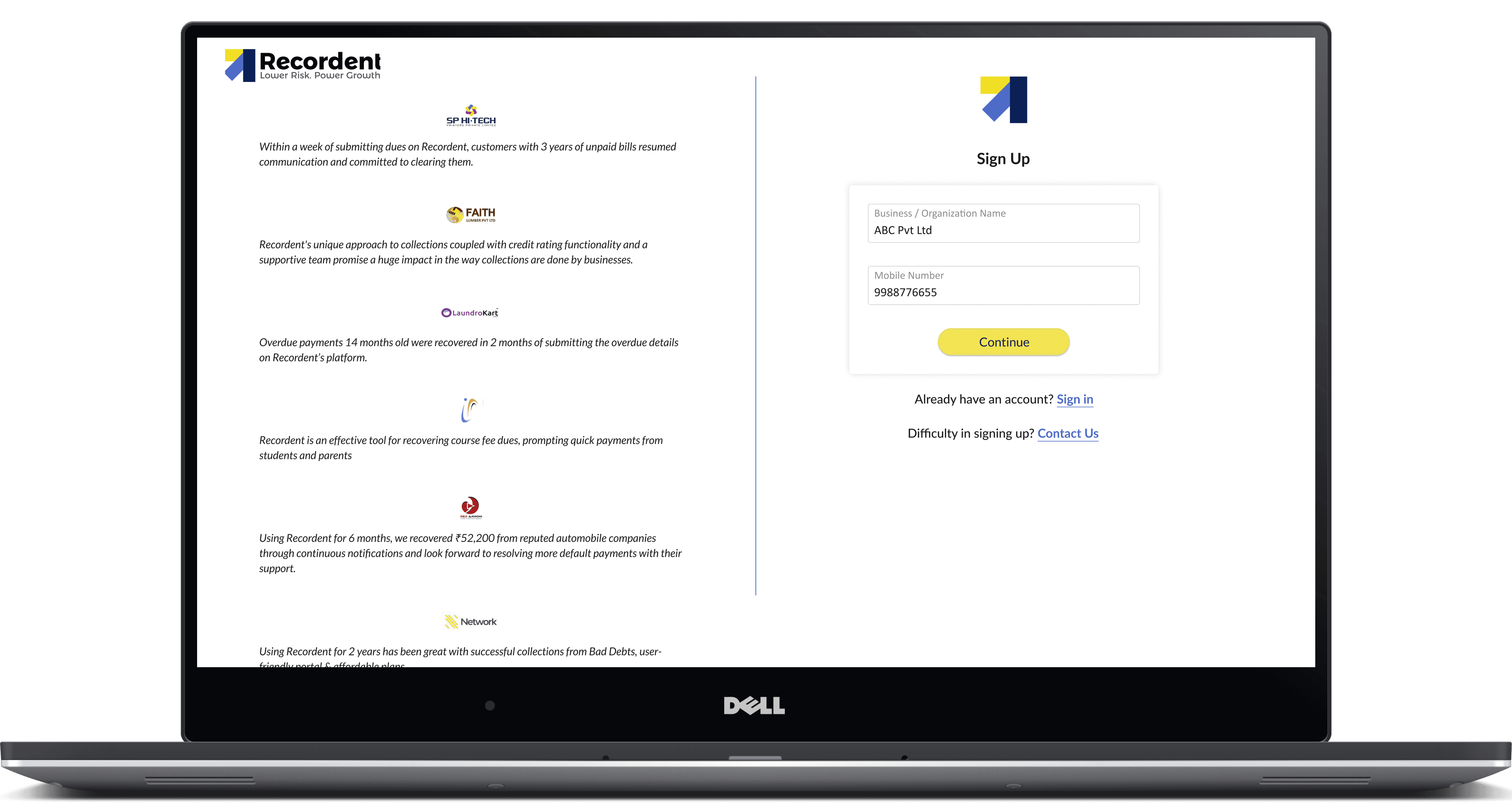
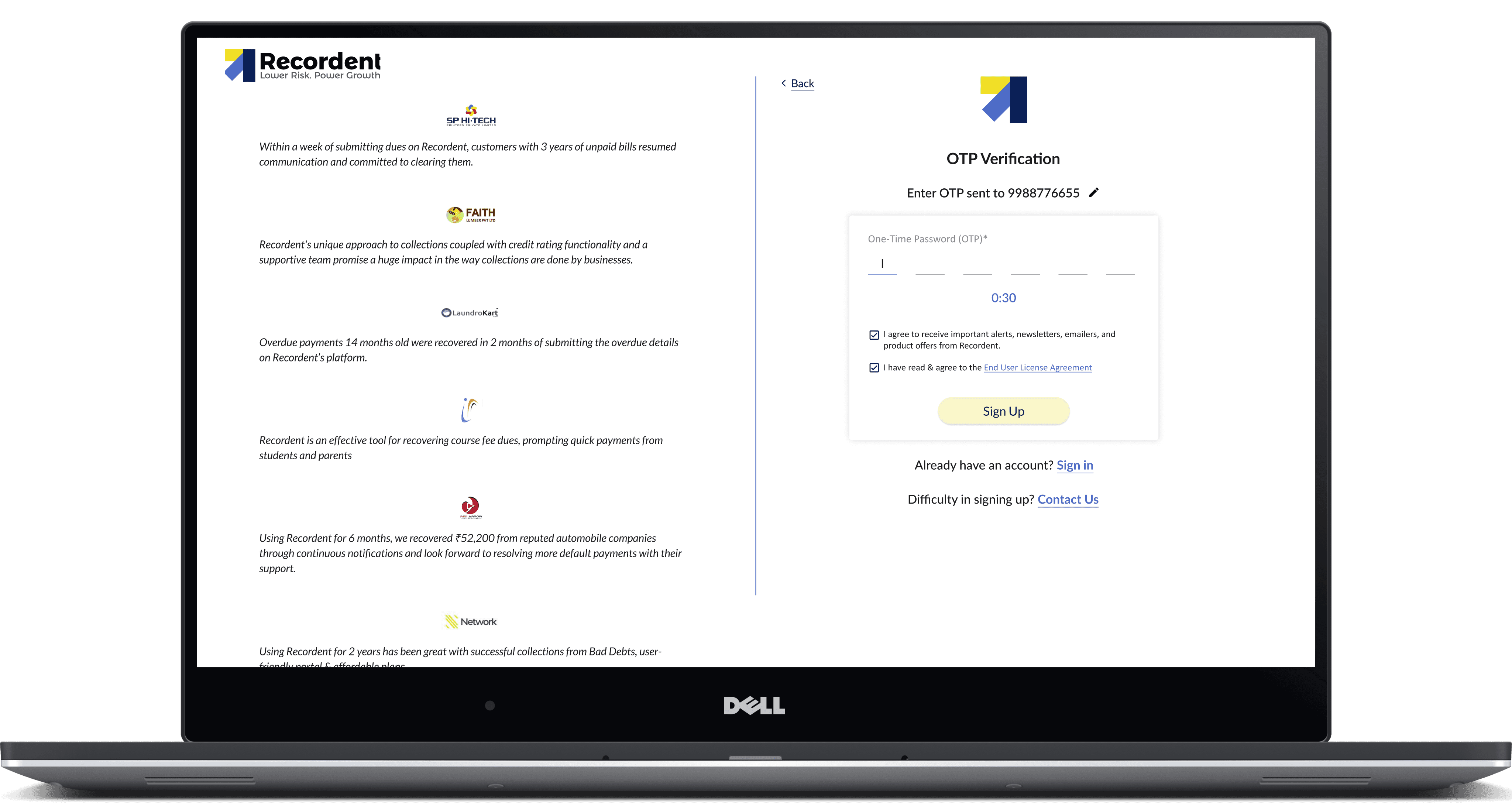
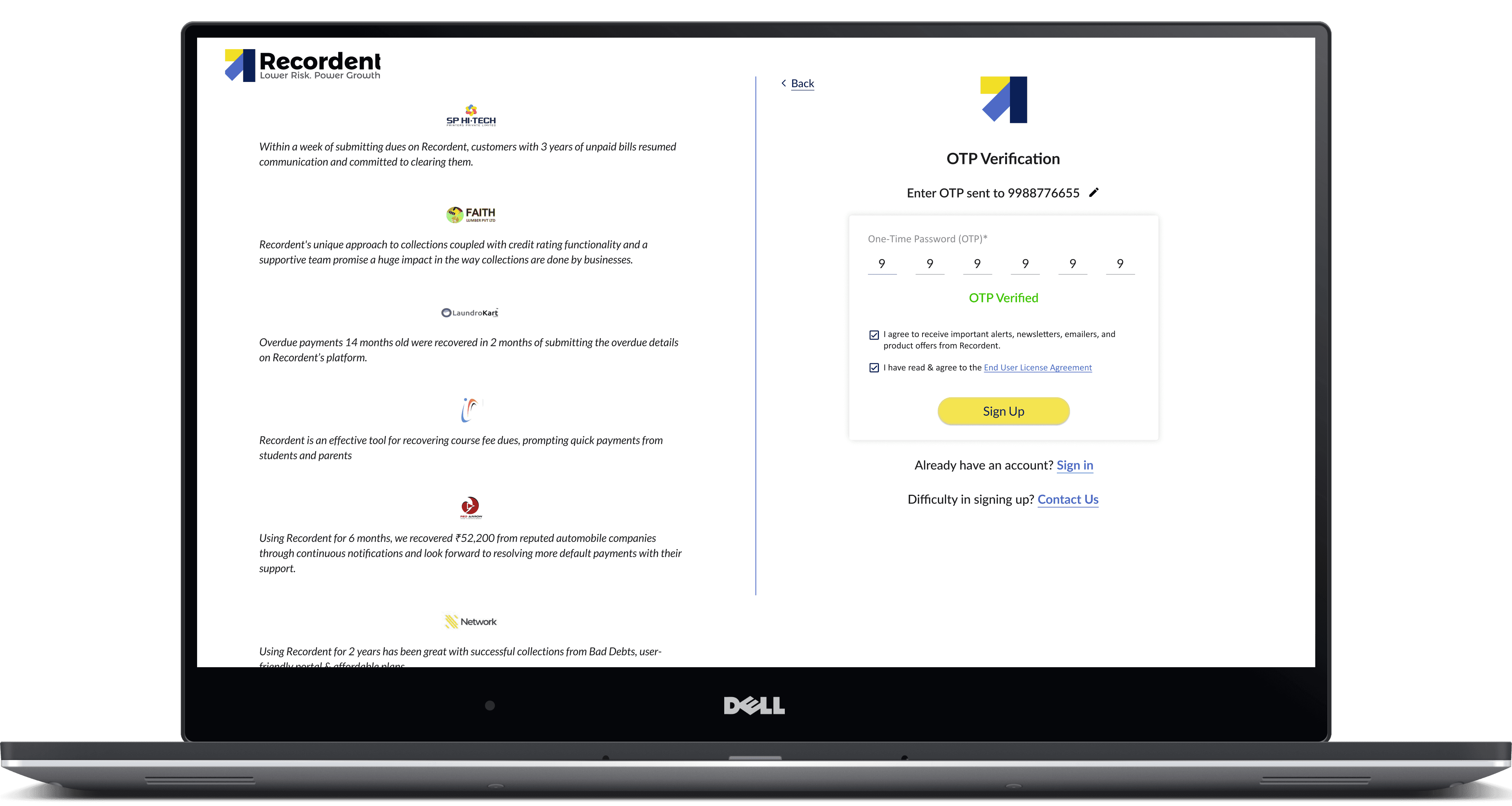
The initial sign-up and onboarding journey at Recordent was identified as a key contributor to early-stage user drop-off and low engagement rates. New users faced challenges such as lengthy forms, ambiguous instructions, and limited contextual guidance, making it difficult for them to complete registration and find immediate value. Users often abandoned the sign-up process due to confusing steps or perceived lack of relevance, resulting in high bounce rates. previous onboarding lacked personalization and failed to communicate the platform's benefits succinctly, causing many users to feel disengaged or uncertain about next steps.
Solution
This project reimagines the experience as a clear, structured entry point that introduces the product, highlights the most important actions, and guides users through a logical path instead of leaving them to figure it out alone. Through improved layout, hierarchy, and interaction patterns, the design helps users quickly understand what they can do here and supports smoother progression into deeper parts of the product. New dedicated subscription landing pages have added more value to the process.
Overview
Recordent is a fintech platform focused on improving transparency and trust in buyer-seller relationships by addressing the problem of delayed payments. The company offers comprehensive credit and collections management solutions for businesses, especially manufacturers, traders, and service providers with tools to manage credit risk, collections, recovery, and analytics.
The initial sign-up and onboarding journey at Recordent was identified as a key contributor to early-stage user drop-off and low engagement rates. New users faced challenges such as lengthy forms, ambiguous instructions, and limited contextual guidance, making it difficult for them to complete registration and find immediate value.
Users often abandoned the sign-up process due to confusing steps or perceived lack of relevance, resulting in high bounce rates. Existing onboarding lacked personalization and failed to communicate the platform's benefits succinctly, causing many users to feel disengaged or uncertain about next steps.
Drop-offs: 67% Upgrades: ~1%
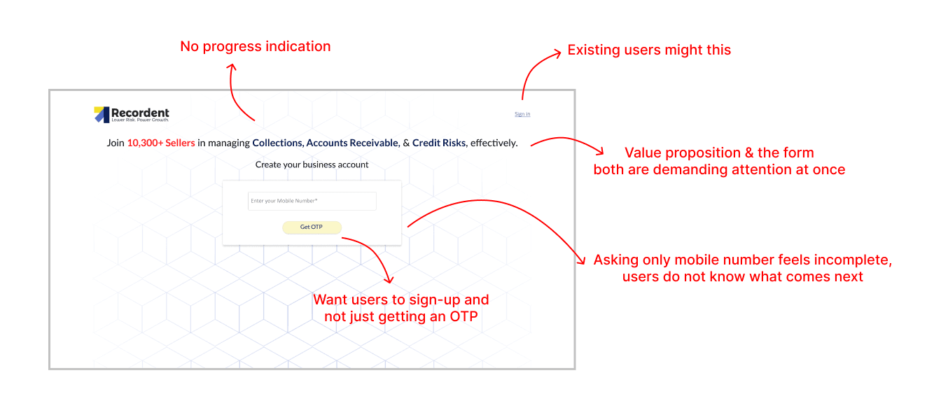
Key issues in previous design
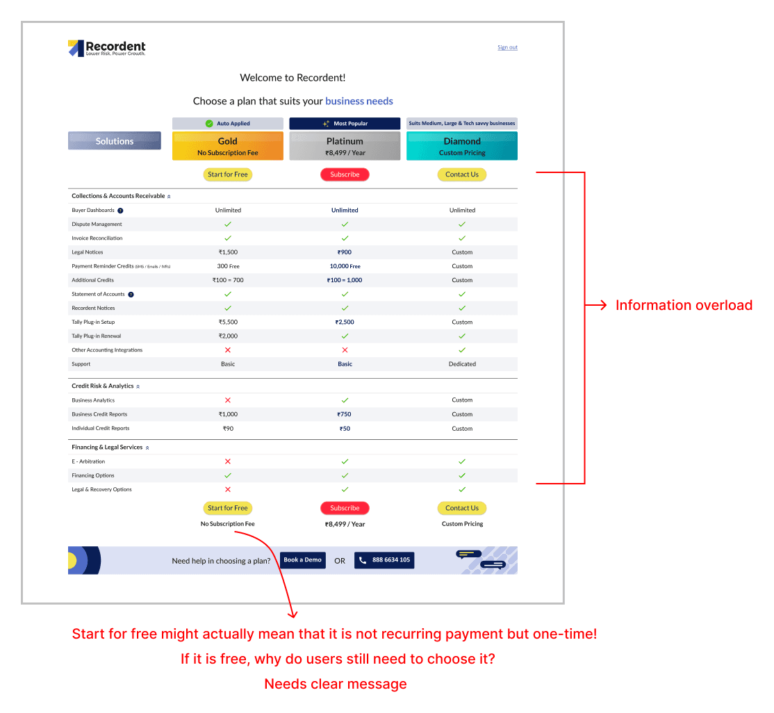
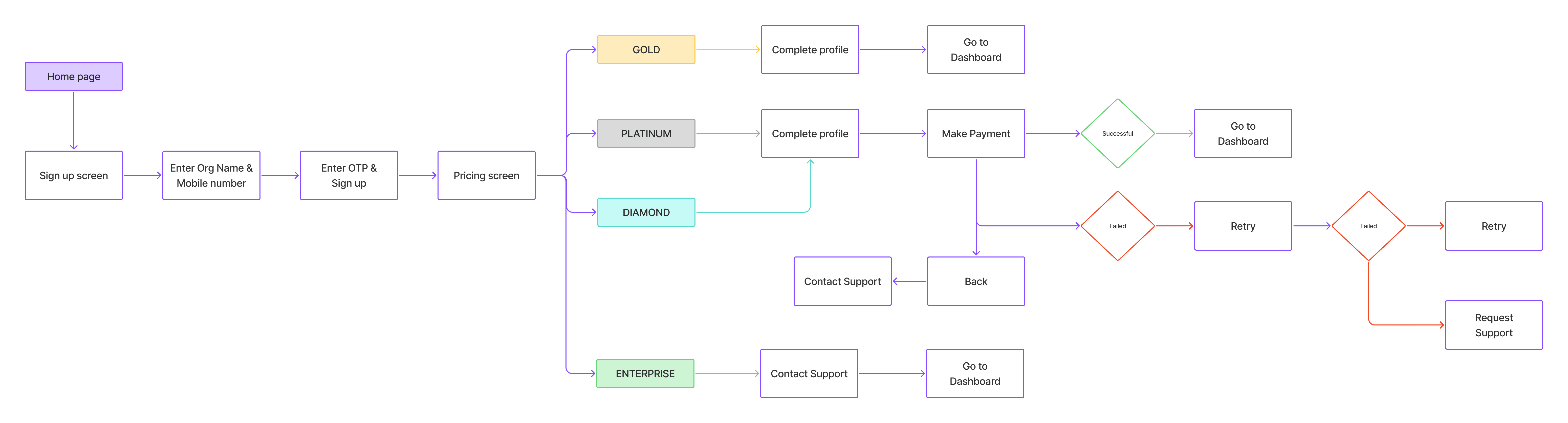
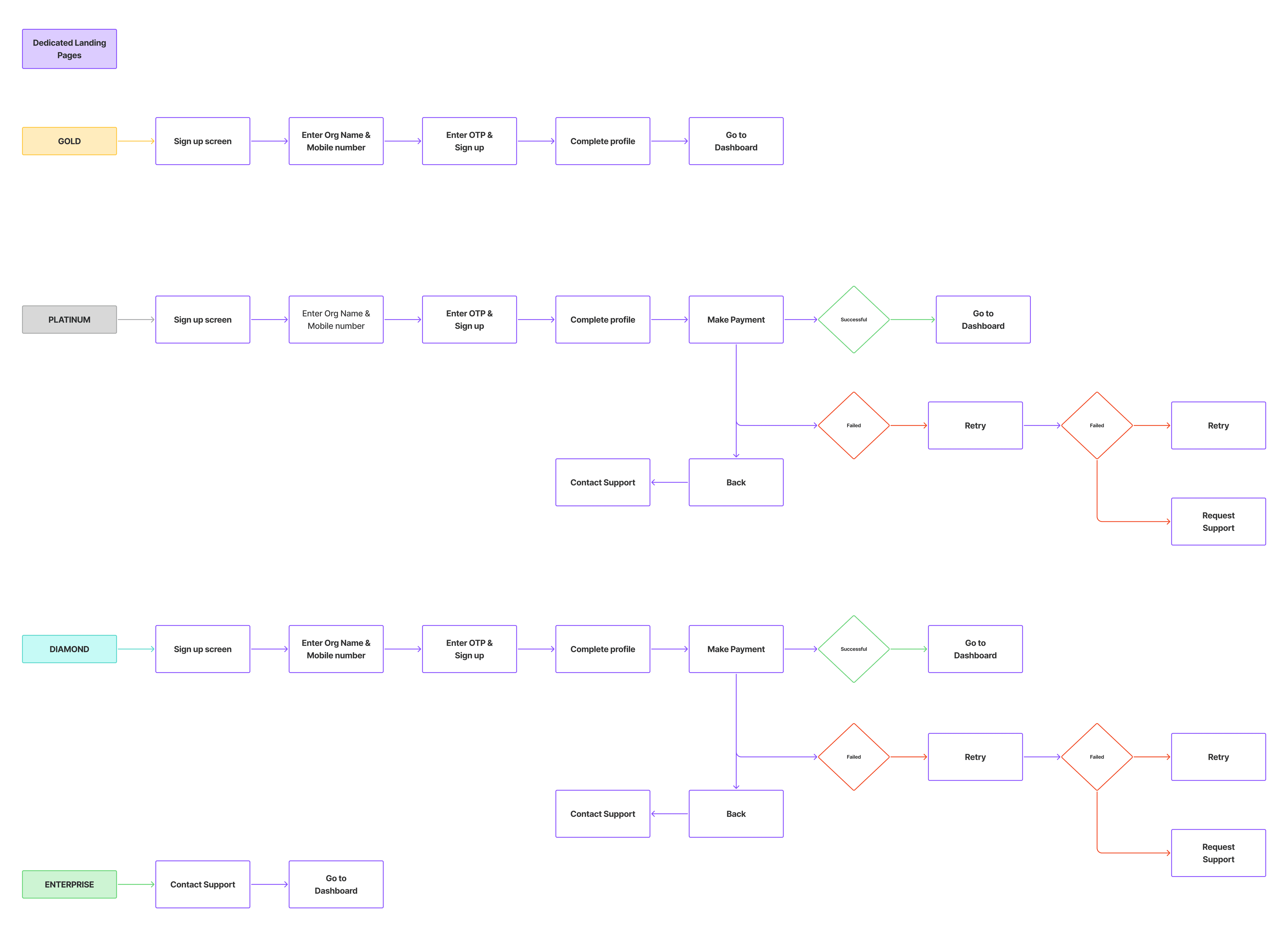
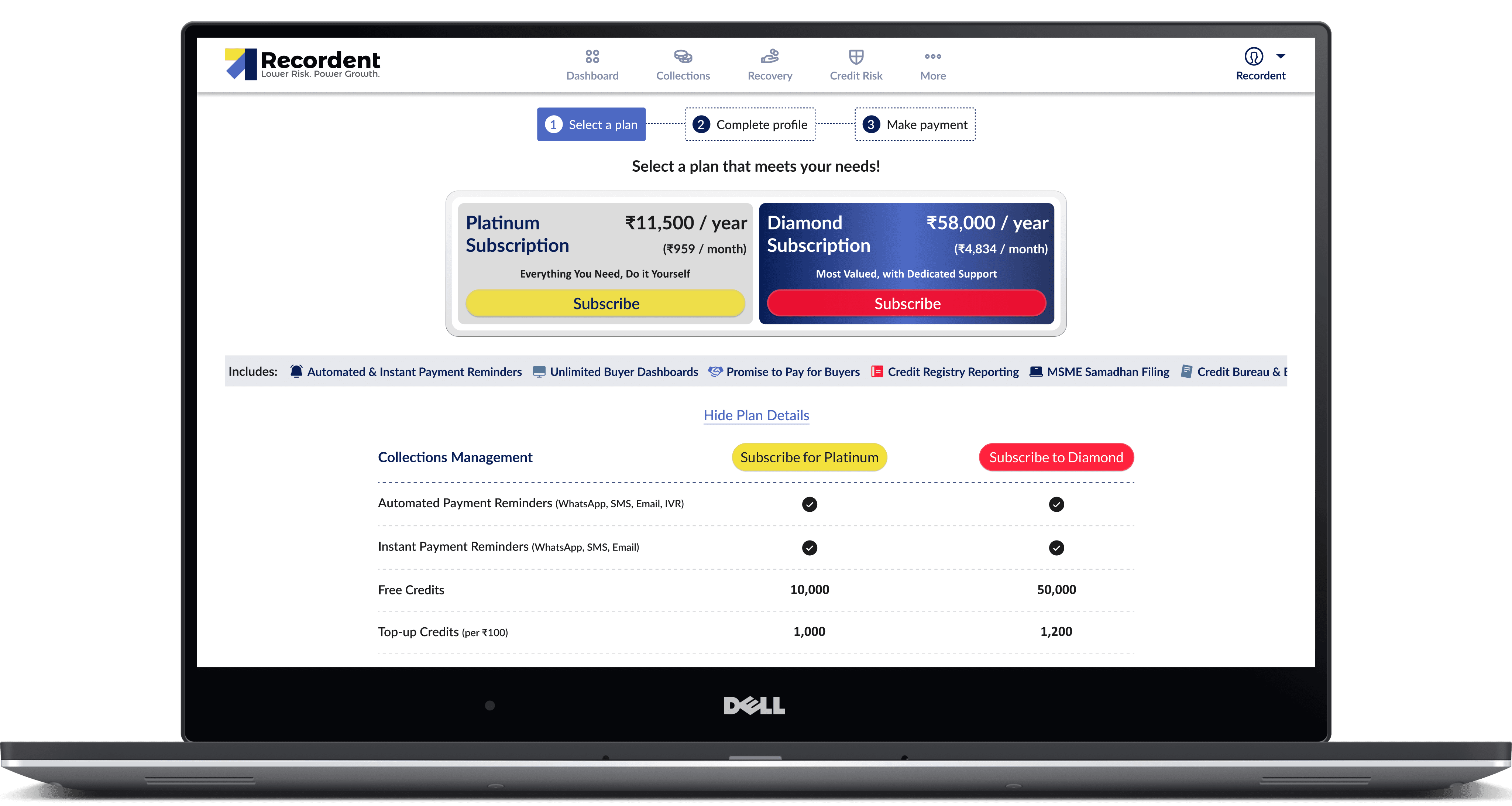
Then the prospects will be directed to pricing page.
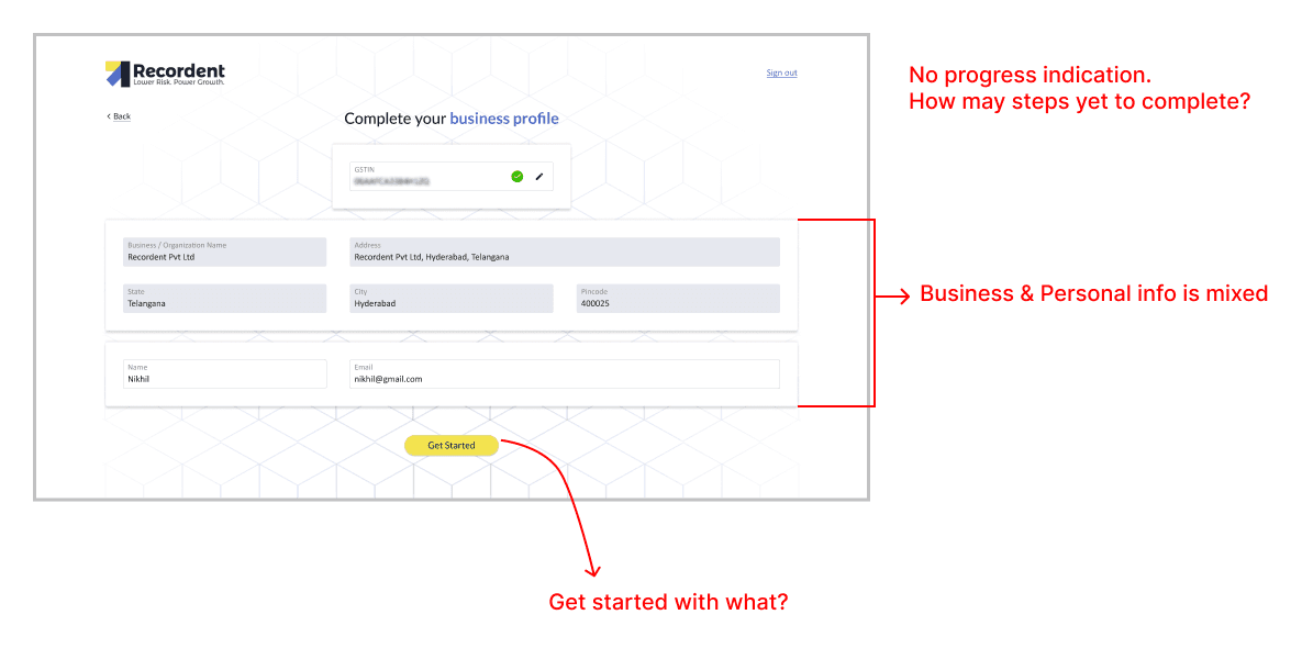
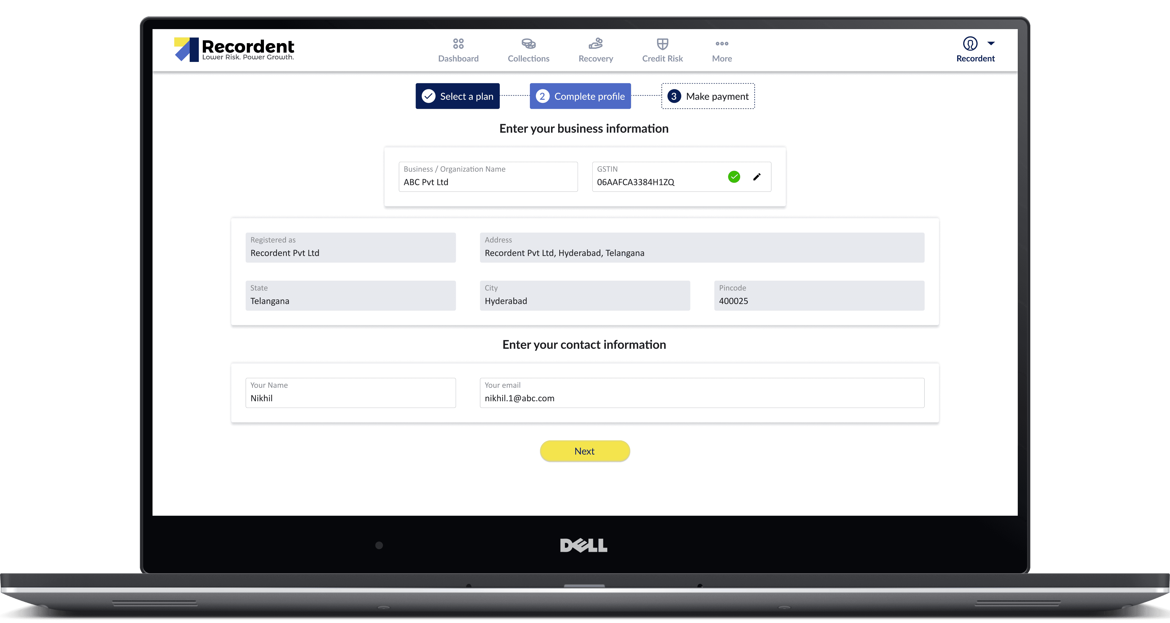
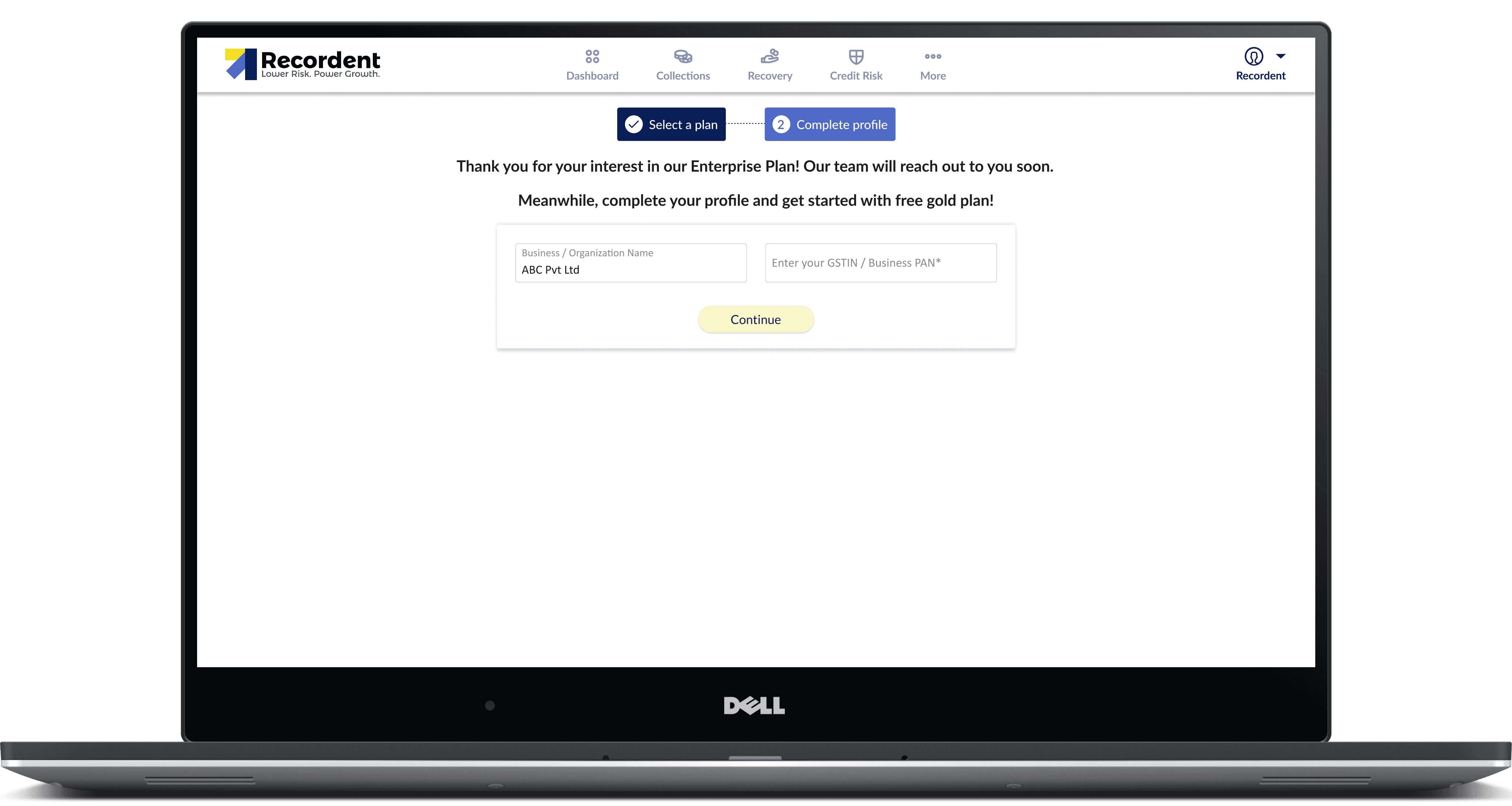
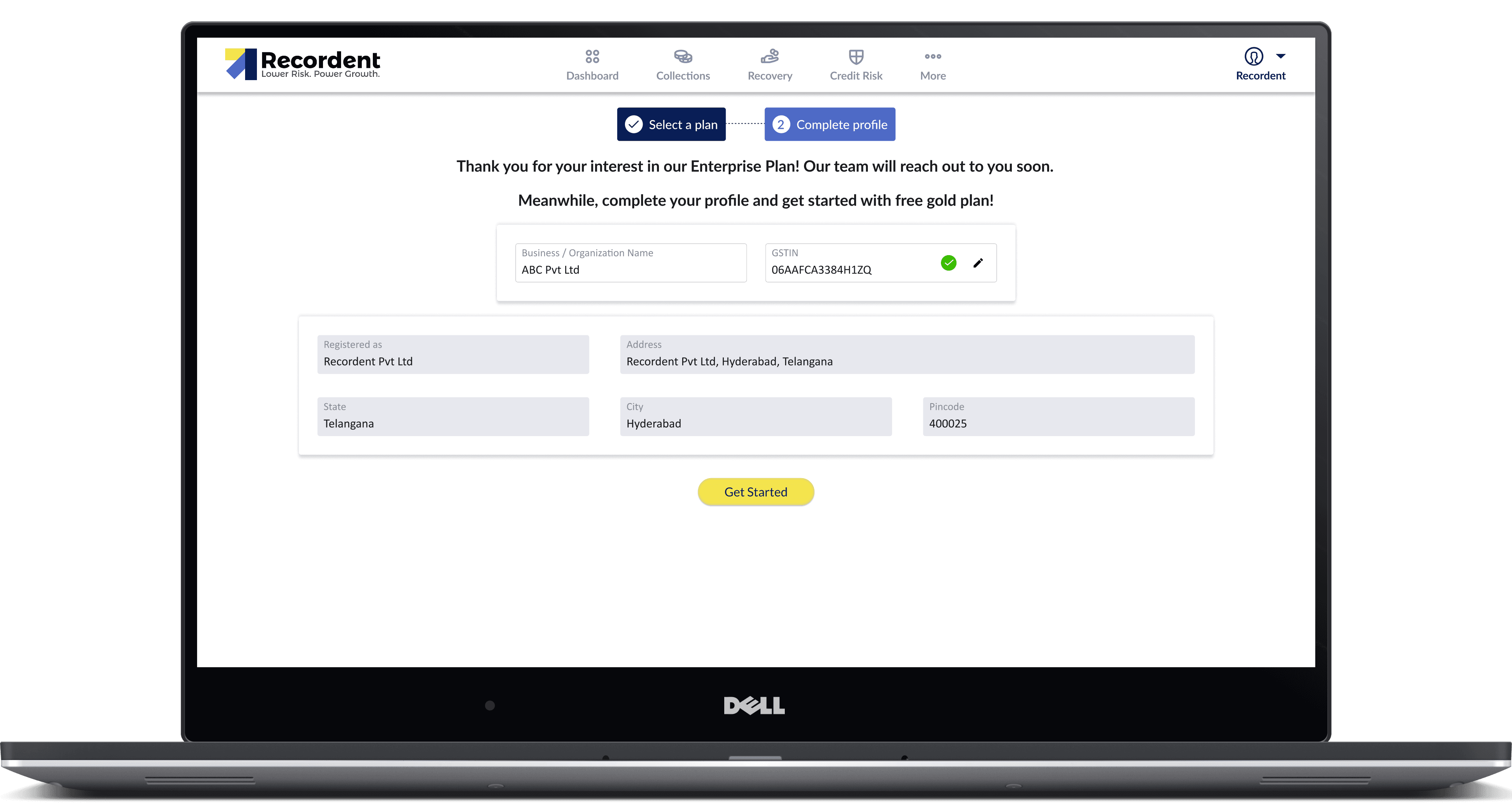
After the prospects choose a plan, they will be asked to enter the GSTIN/ business PAN and verify. Then, the business details will be auto-populated and the prospect has to enter their name and email to proceed.
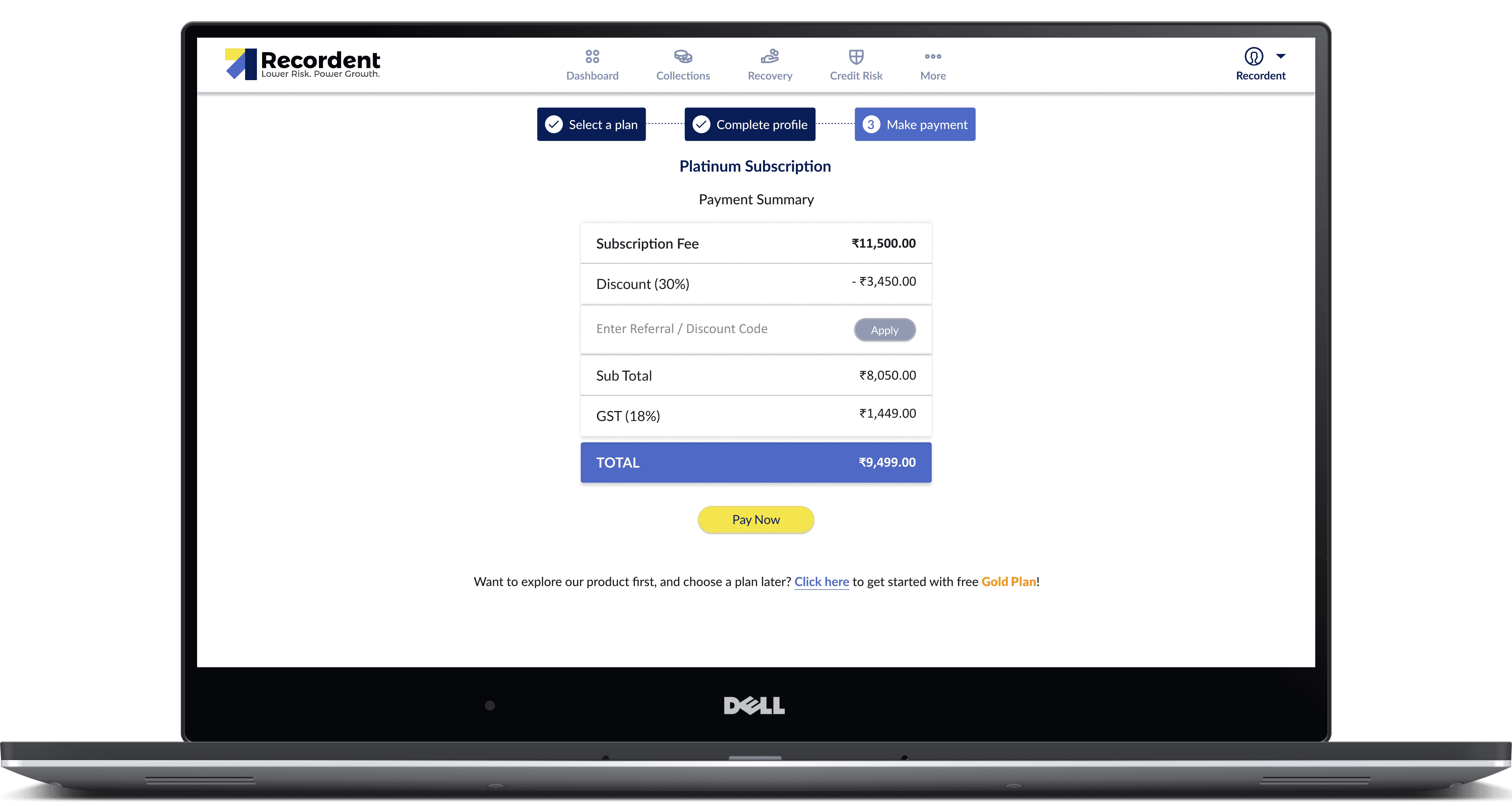
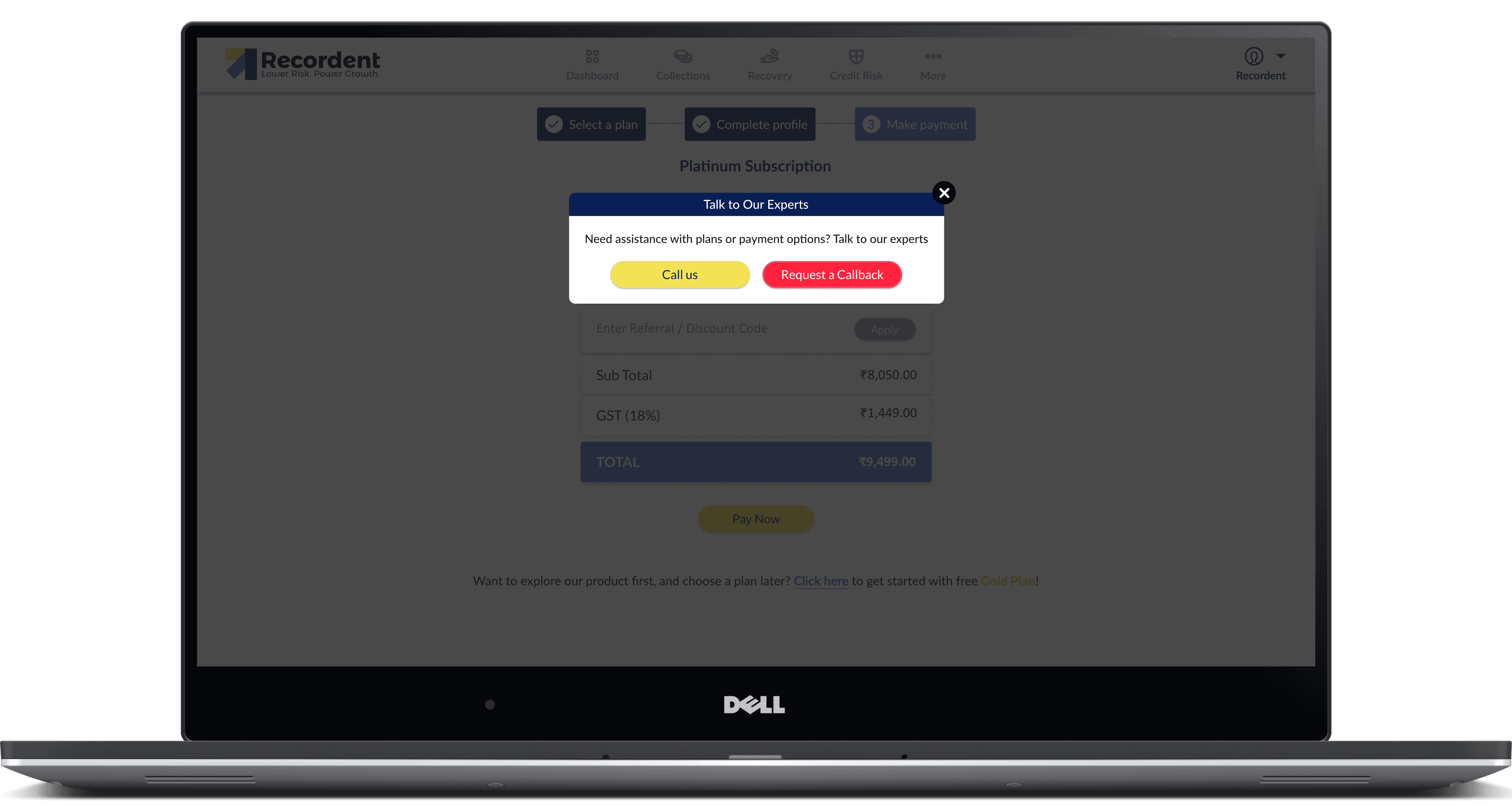
When clicked on "Get Started", the payment screen will be shown:
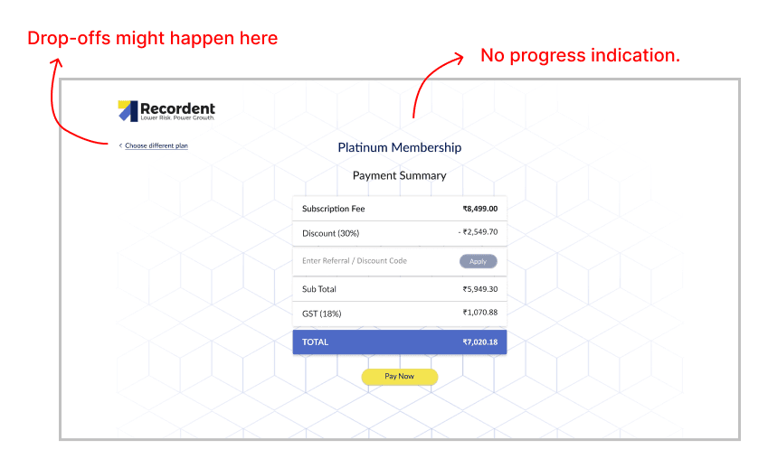
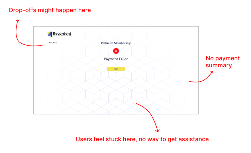
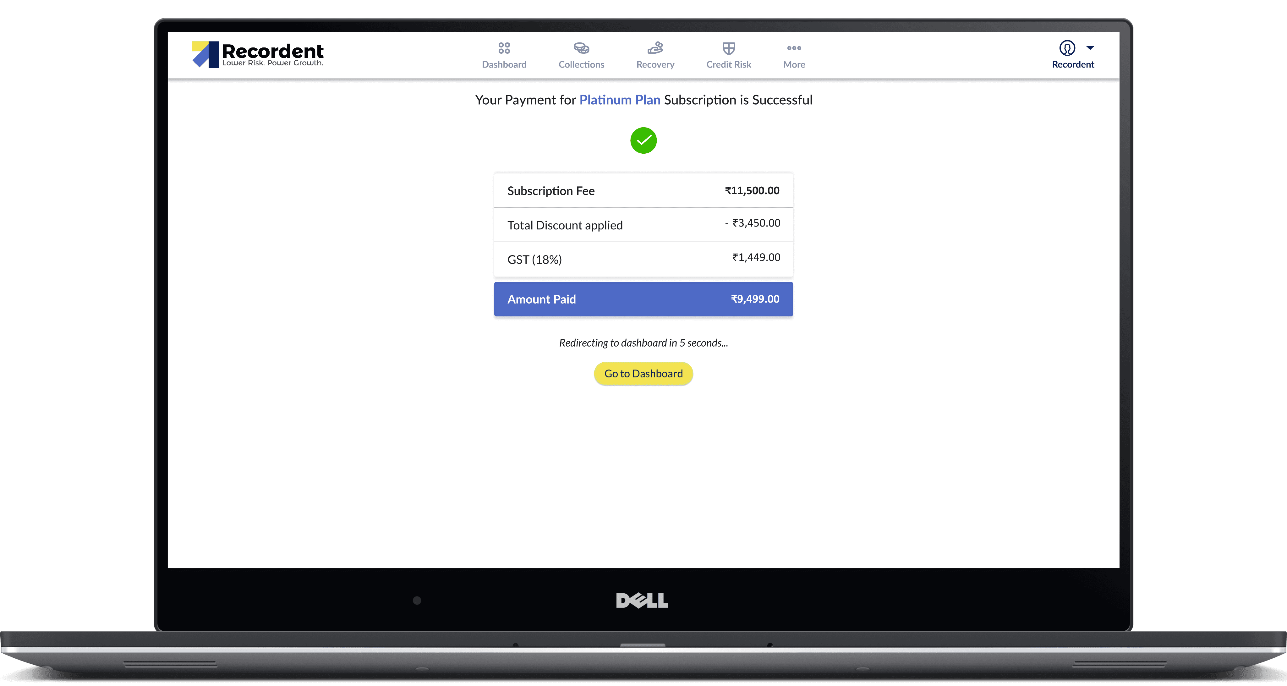
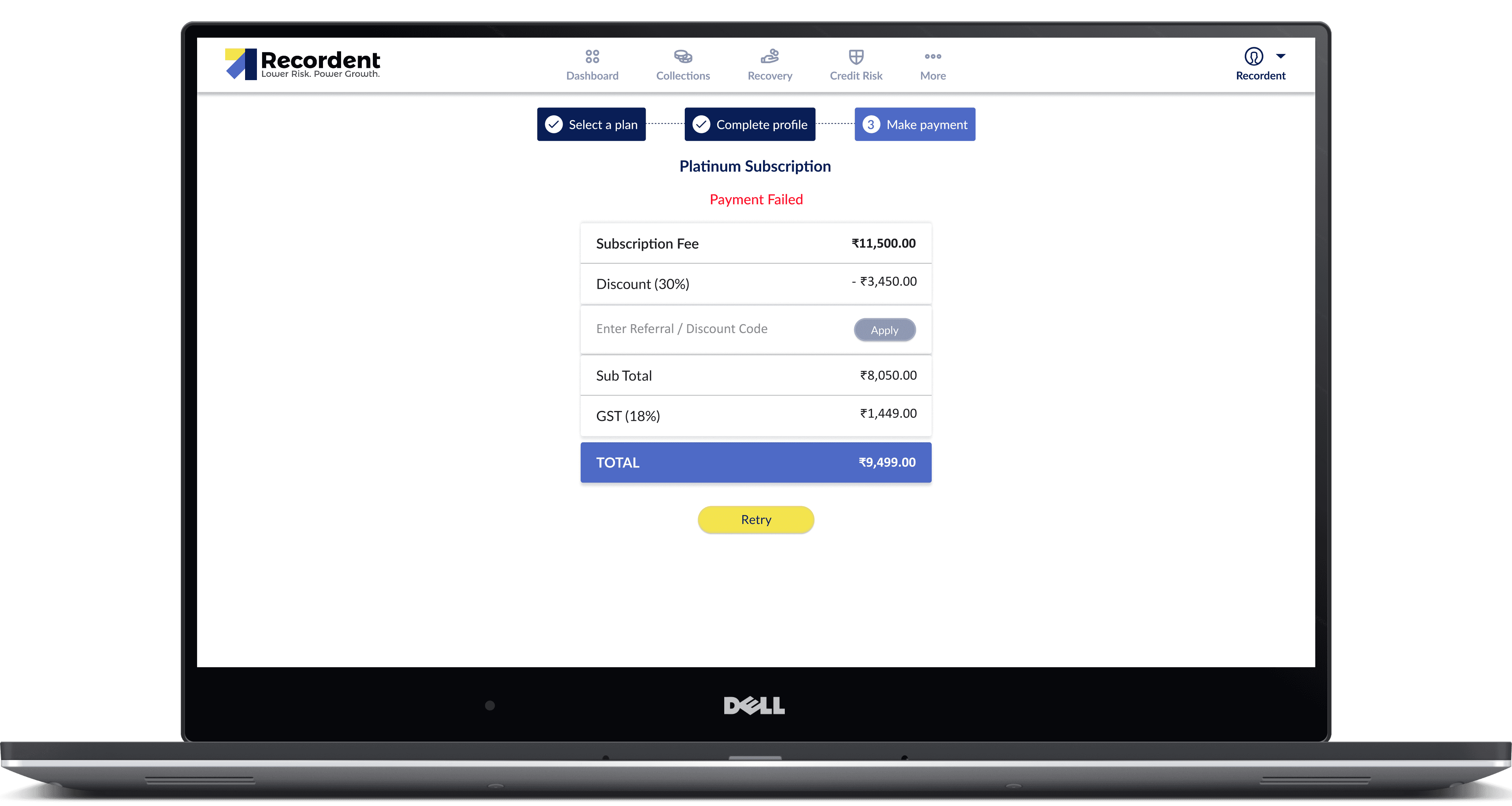
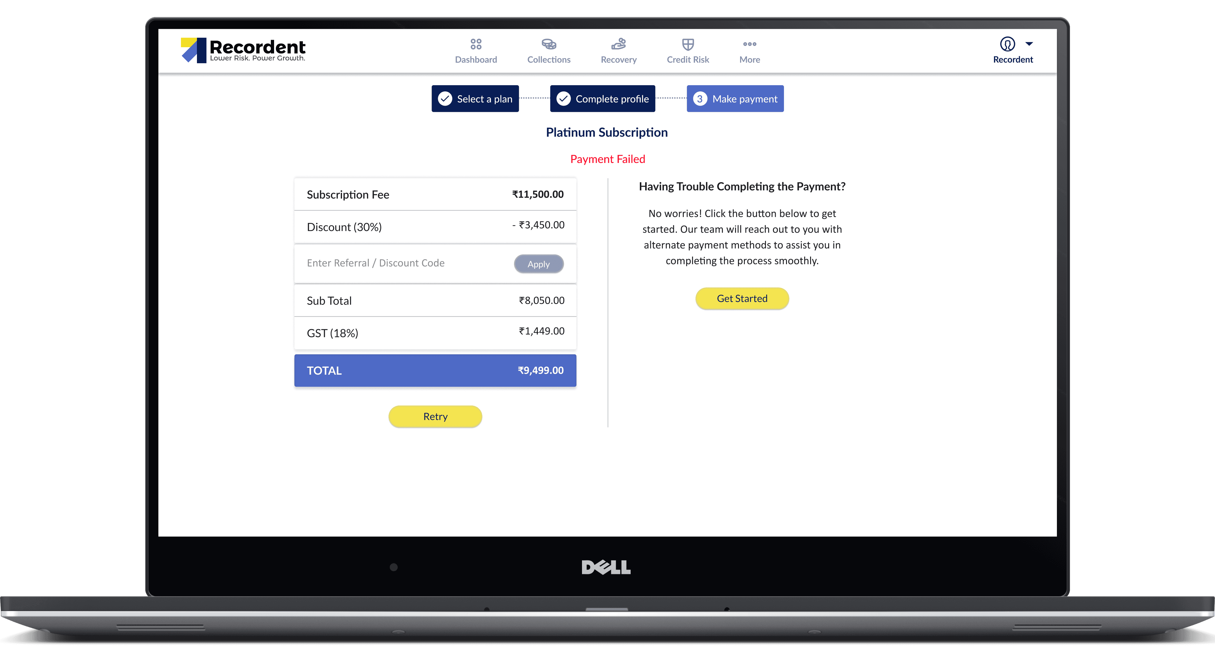
Once the payment is successful, the prospect is taken to the dashboard, otherwise the payment failure screen will be shown:
Key enhancements during the process
Platinum and Diamond are now the primary, recommended plans with stronger visual emphasis, clearer value messaging, and prominent CTAs.
An Enterprise plan was introduced for larger customers needing custom limits, or dedicated support.
Gold (free) is still available but visually de‑emphasized and moved out of the primary focus so users explore paid tiers first.
Messaging frames Gold as a basic starter option, suggested only for users who actively look for a free tier or are not yet ready to upgrade.
Separate GOLD, PLATINUM, and DIAMOND pages were created to go deeper into outcomes, use cases, and social proof for each tier, beyond what fits on the main pricing grid.
These landing pages enable targeted campaigns, with focused messaging that maps specific customer segments to the most suitable plan.
User Journey
Increase in Sign-ups: 22% Upgrades: 3-4%
Below are the redesigned screens
01
02
03
04

05
06
07
08
09
010
011
012
013
014
See also


